 Back to works
Making Web3 Campaigns Feel More Alive
Stiqy needed a community experience where users could discover campaigns, track progress, earn rewards, and stay connected with what was happening around them. I explored a more expressive direction that kept those familiar Web3 patterns, but made the experience feel closer to a live gaming event than a traditional campaign dashboard.
Starting From a Familiar Web3 Pattern
The existing community experience worked primarily as a place to browse campaigns. Users could see active and past campaigns, but the experience was largely content-driven. Progress, rewards, rankings, and community activity did not feel like part of one continuous experience. That became the opportunity: instead of simply redesigning a campaign list, I wanted to explore what would happen if the page felt more like a destination users would return to during an active event.
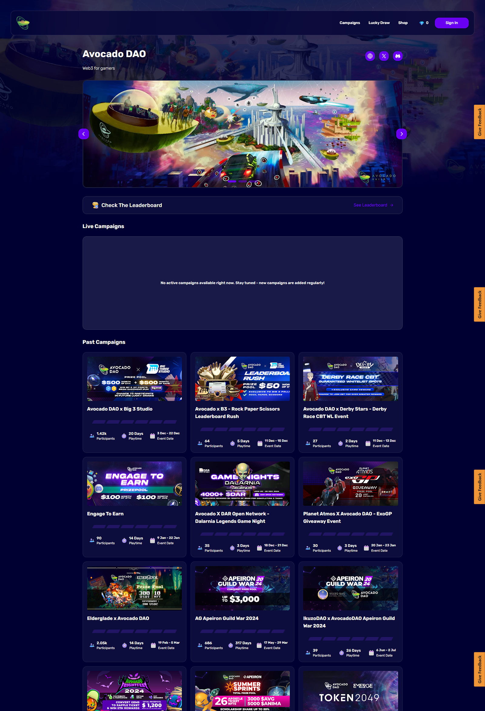 Image unavailable
Understanding How Web3 Platforms Encourage Participation
Before defining the new experience, I looked at how other Web3 products structured quests, campaigns, rewards, and community participation. I was less interested in copying their visual styles and more interested in understanding what information they prioritized, how they communicated progress, and what kept users moving toward the next action.
 Image unavailable
Benchmark Takeaway
The pattern was clear: users need to understand what is happening, what they can do, what they can earn, and where they currently stand. I kept those familiar interaction principles, but saw an opportunity to make Stiqy feel more energetic and event-driven.
Defining What Matters First
From the benchmark, I mapped the experience around what users would most likely need during an active campaign. Instead of giving every element equal priority, I structured the page around a simple sequence: Understand the event → check progress → see rewards → discover campaigns → stay connected with the community. This hierarchy became the foundation before I explored any visual styling.
 Image unavailable
From Campaign Dashboard to Live Event
Once the hierarchy was clear, I pushed the visual direction away from the typical Web3 dashboard and closer to a live gaming event. Bold campaign artwork establishes the event as the main focus, while progress, rankings, rewards, and community activity make participation feel more visible and active.
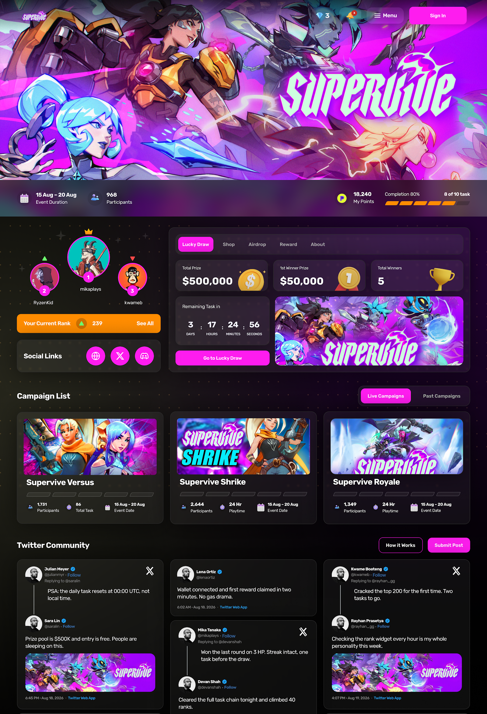 Image unavailable
Looking Back
This project became an exercise in balancing familiarity with personality. I kept the interaction patterns recognizable, while pushing the visual direction further to make the experience feel more like a live event than a traditional Web3 campaign dashboard.
